Elemental Climbing
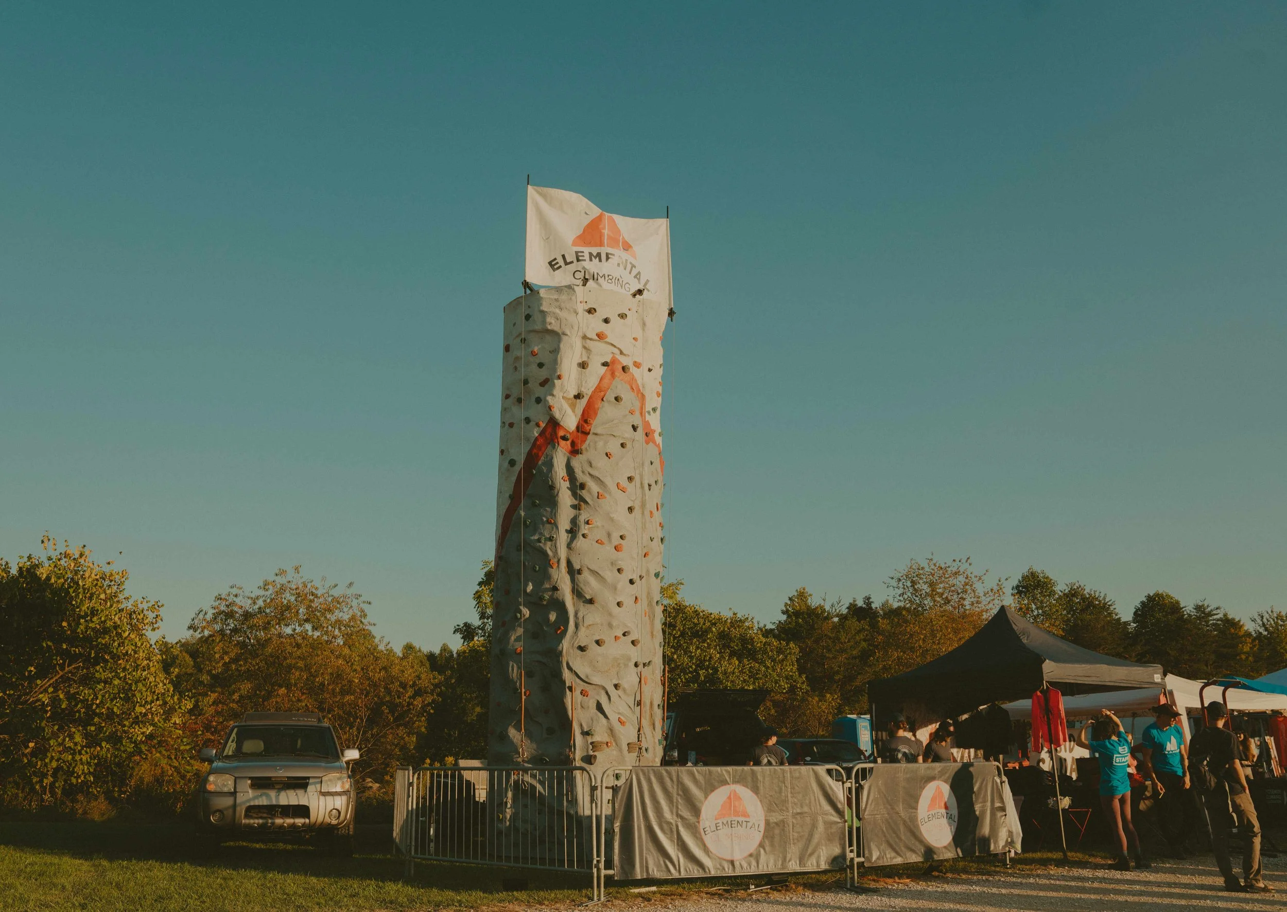
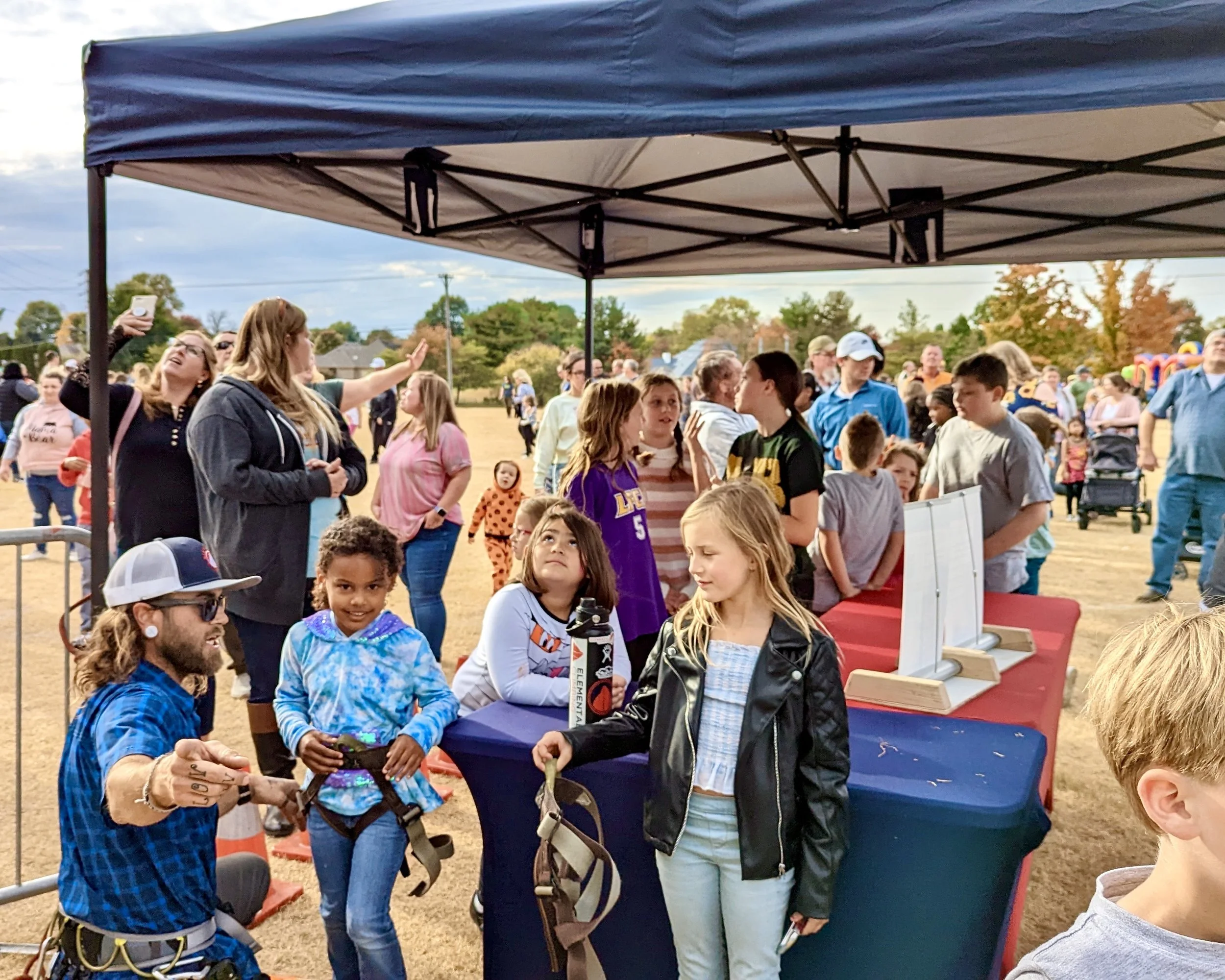
Elemental Climbing found its beginning as a simple vision shared by a small group of close friends. A vision to develop and care for their own community of rock climbers in Louisville, Kentucky, as well as a deep desire to extend an invitation to others to join that community.
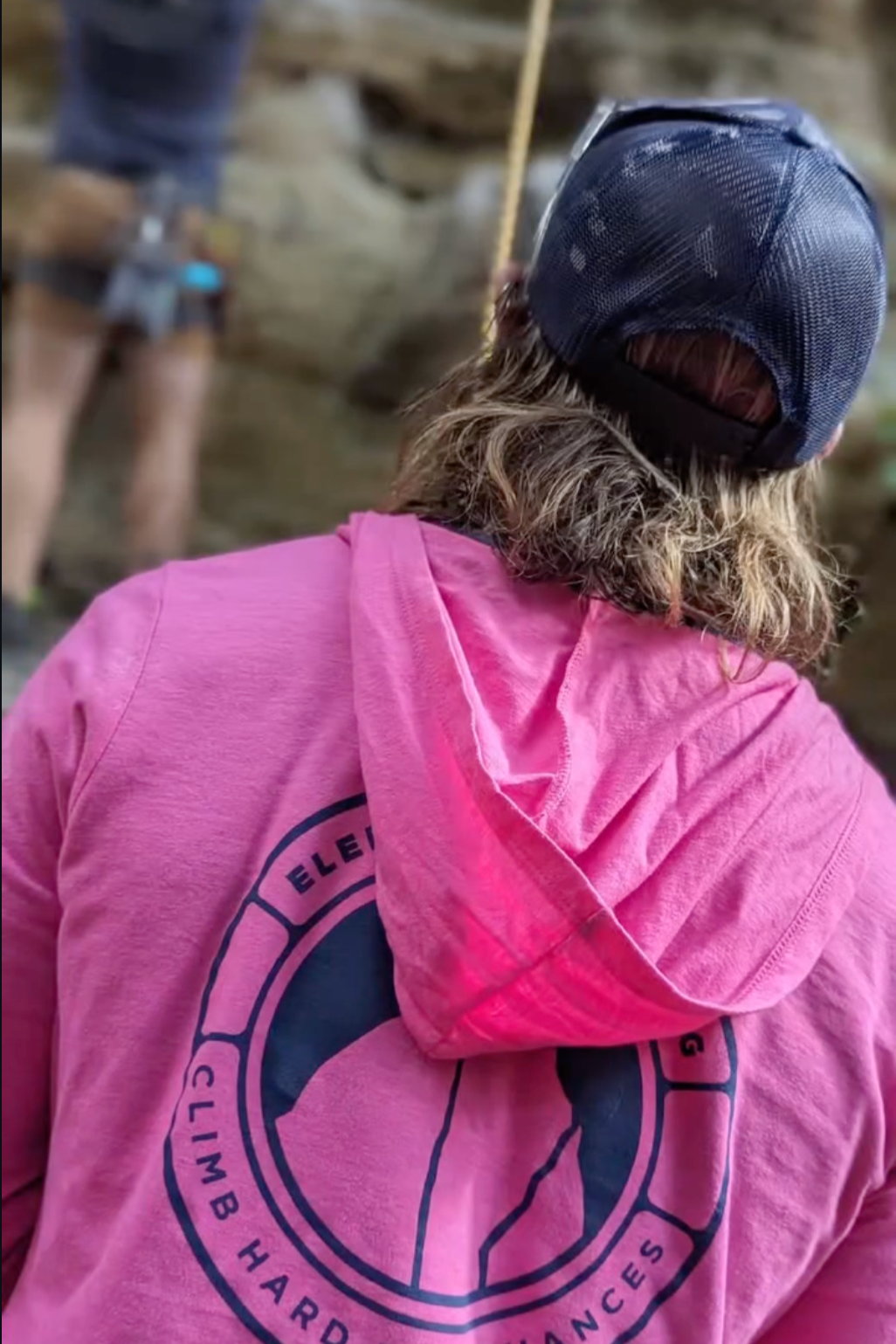
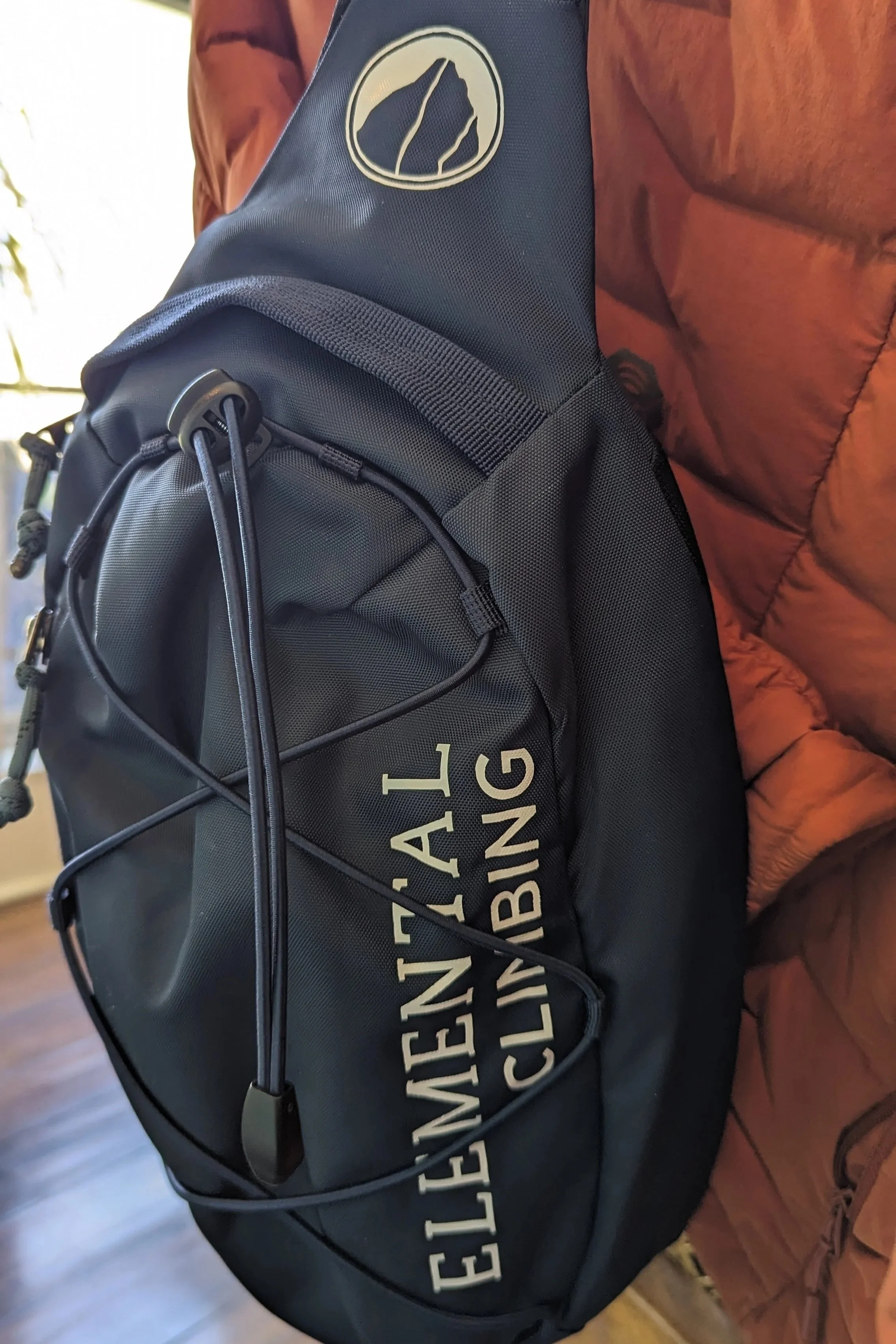
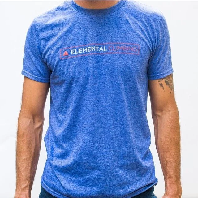
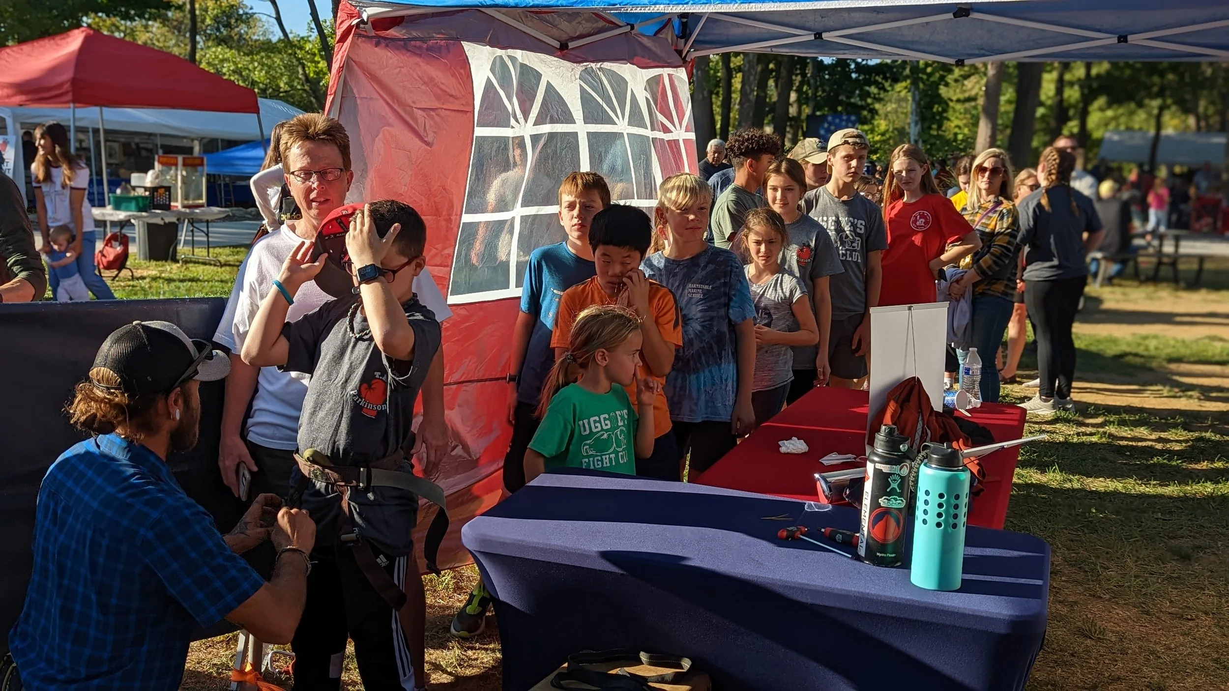
The logo system is simple and iconic, built for versatility and instant recognition, while the hand-painted and expressive typography used in event graphics adds energy, grit, and personality. Earthy grays paired with strong accent colors reinforce authenticity and approachability, positioning the brand as inclusive but serious. Welcoming climbers of all levels while staying grounded in the discipline, progression, and shared challenge at the heart of climbing culture.
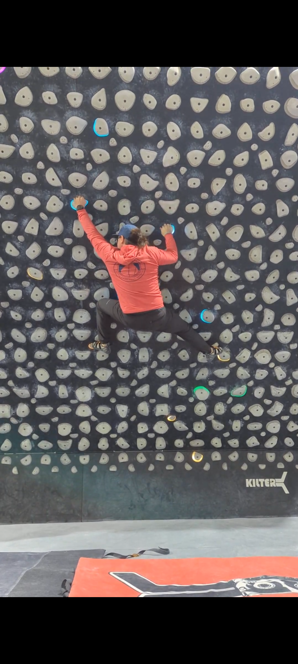
Mobile Climbing Aesthetic
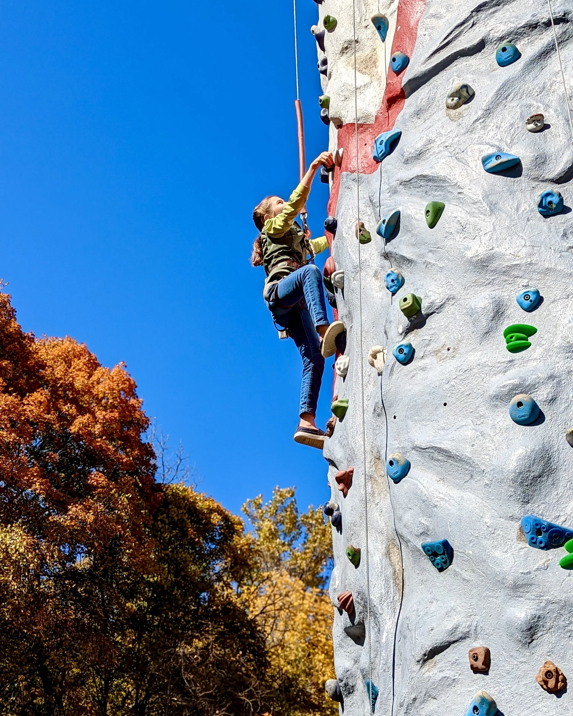
Bright Visuals
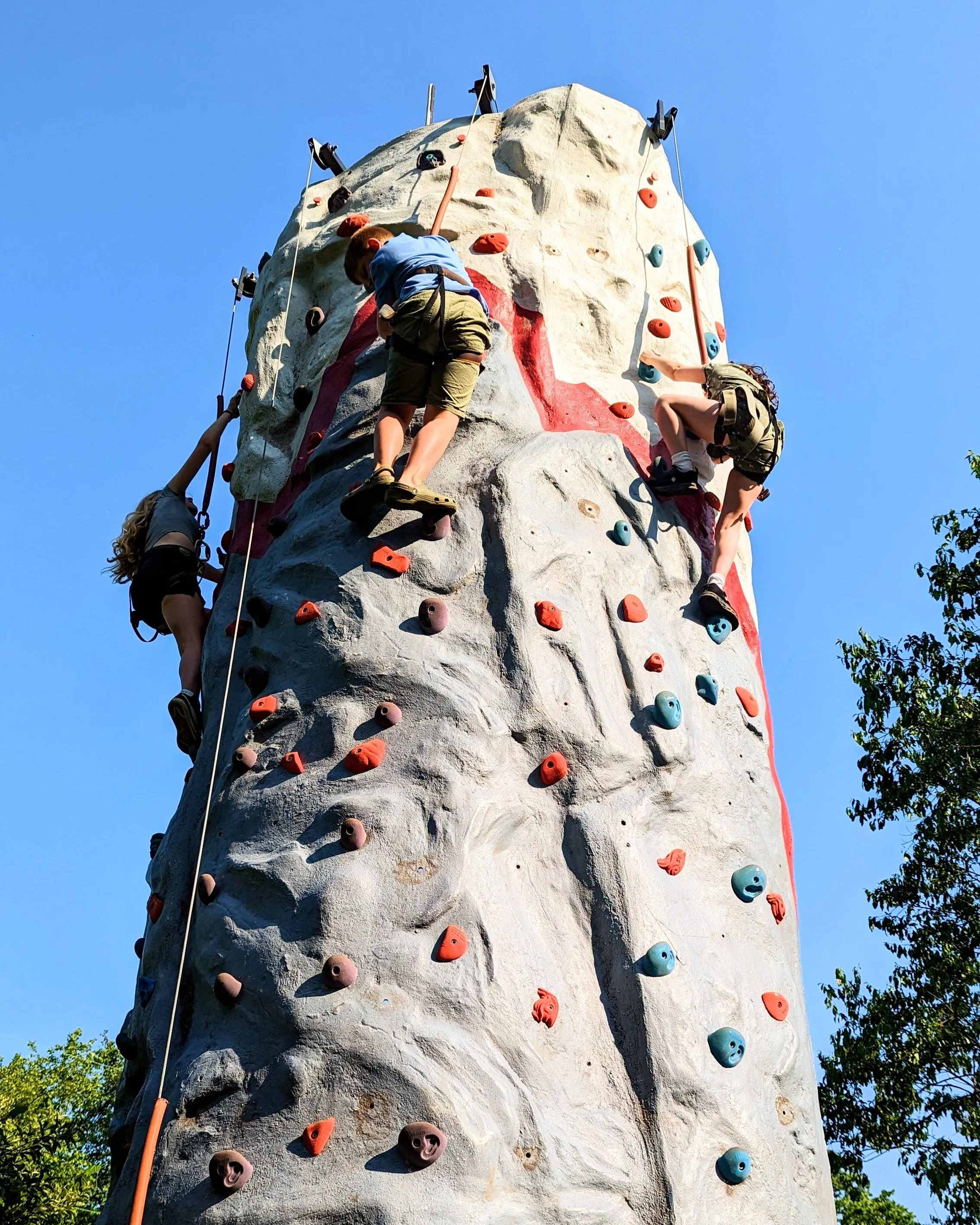
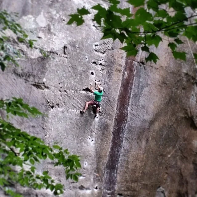
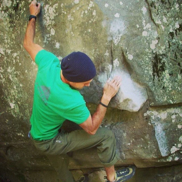
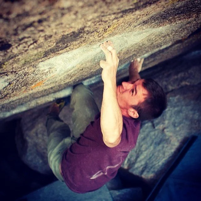
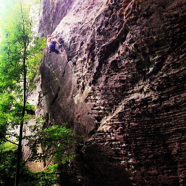
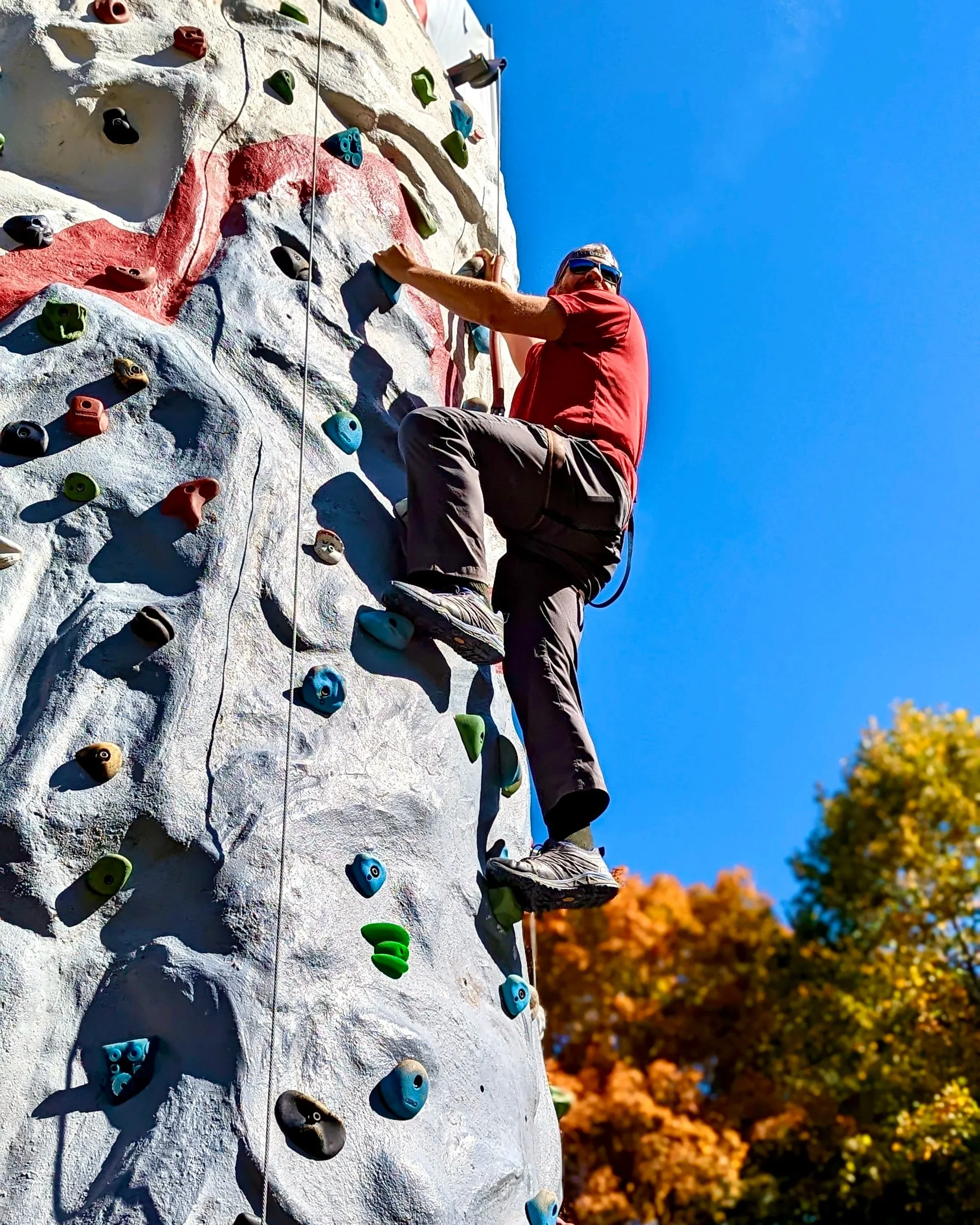
Lots of action
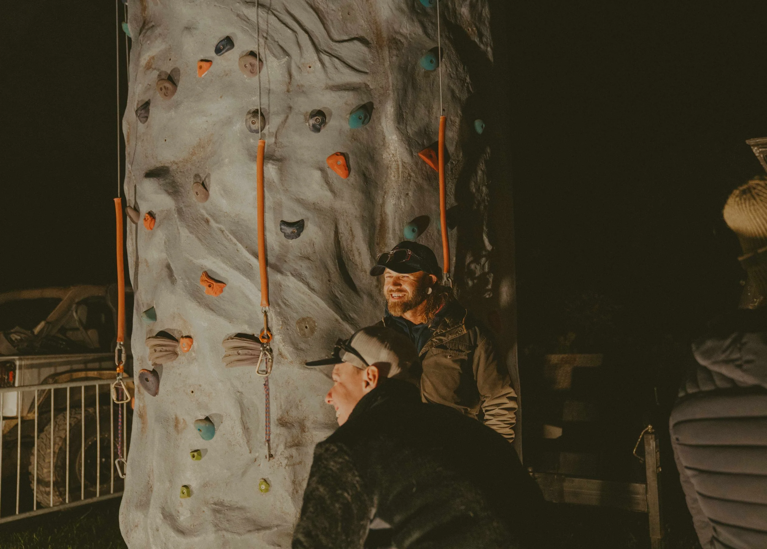
good times for all

Climb Hard
Take Chances
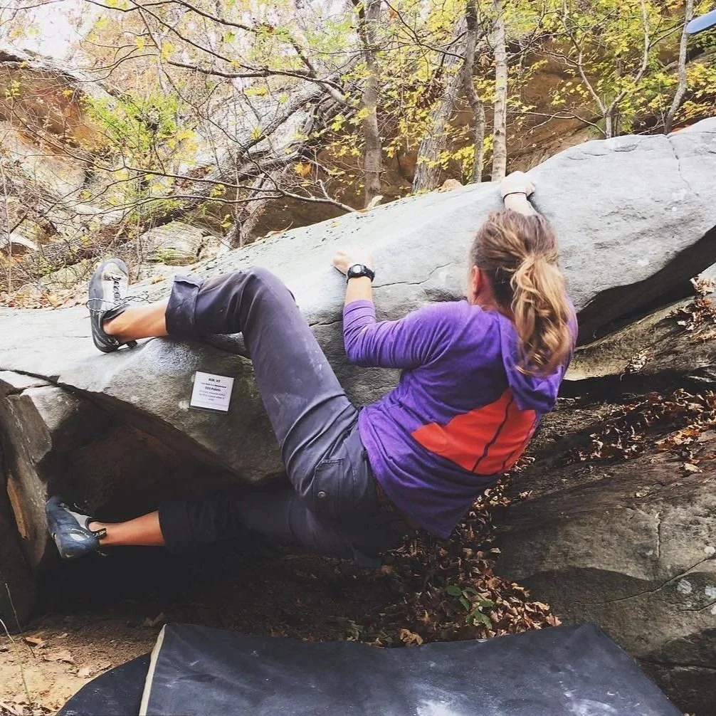
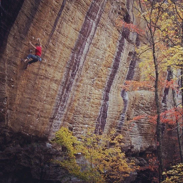
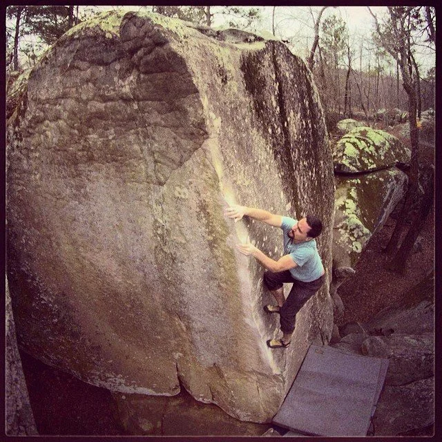
Bold visuals, community-driven climbing identity are rooted in both outdoor tradition and modern gym culture. The visuals balance raw, real-world climbing moments, think chalk, rope, rock texture, and movement alongside clean, confident branding that scales from events to gear and apparel.